DIGITAL / BRAND DESIGN
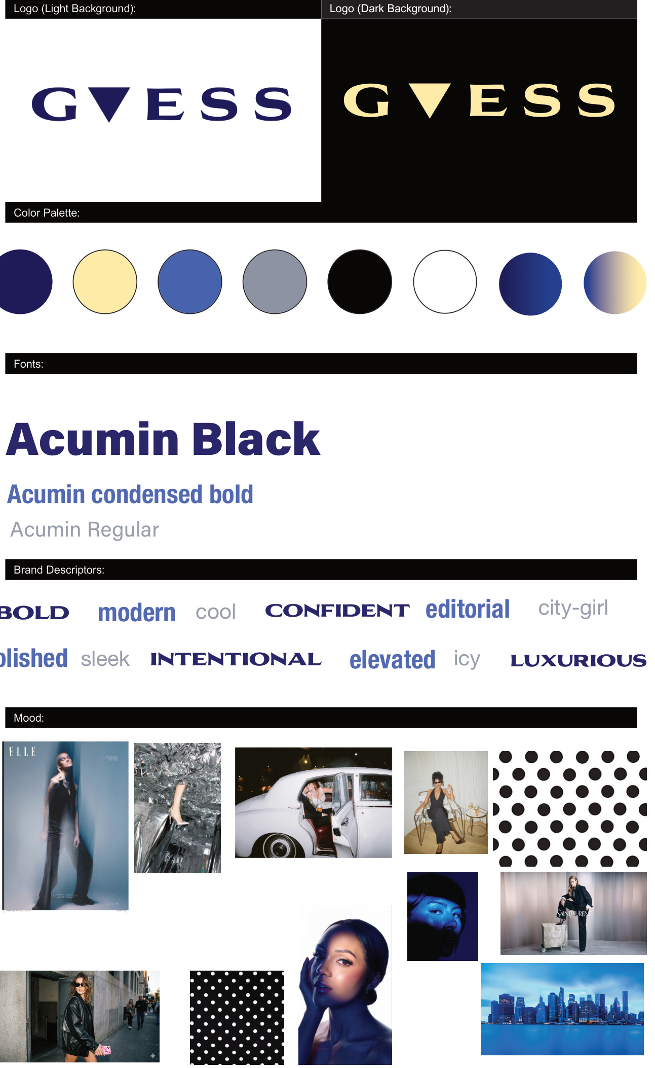
GUESS redesign
A brand identity across advertising, web and email.
Open case study ↗MADE WITH A POINT OF VIEW
Digital layouts, pencil studies and ideas brought to life by hand.
10 projects
DIGITAL / BRAND DESIGN
A brand identity across advertising, web and email.
Open case study ↗SILVR / DIGITAL CAROUSEL
Outfit boards for pool parties, movie nights and backyard plans, built around a recognizable recurring series.
More SILVR work ↗SILVR / DIGITAL CAROUSEL
The closet series keeps a recognizable format while introducing a different celebrity’s style.
More SILVR work ↗SILVR / DIGITAL CAROUSEL
Character outfits turn a familiar TV series into a recurring source of fashion inspiration.
More SILVR work ↗DIGITAL ADVERTISING
For this advertising design project, I created two ads built around the tension between a night out and the plans waiting the next day. I used bright colors, bold headlines and humor to make the ads stand out. “Presentation tomorrow? No problem” connects the gummies to a familiar situation, while the beach ad uses a double meaning to make viewers pause. My approach was to give each ad a clear hook and keep the product central to the design.
DIGITAL FLYER
I designed a promotional flyer for a tropical fish sale, using layered fish and plant illustrations to create an underwater scene. The large “Fresh Fish” headline introduces the theme, while the discount sits inside a bubble to make the offer easy to spot. I used a coordinated color palette and shadows to give the composition depth. The goal was to make the flyer visually playful while keeping the sale details and store information easy to find.
SCULPTURE & PHOTOGRAPHY
I made the pig sculpture, then staged and photographed it for Notable, a fictional magazine we created, using “Fancy” as the tagline. The concept explores how people reshape the natural world into something manufactured and materialistic. I covered a familiar animal form in gold and surrounded it with banknotes, turning it into a symbol of wealth and excess. “Fancy” gives the image a playful first impression, while the contrast between the animal and its artificial surroundings asks viewers to think about what we choose to value.
PENCIL
These pencil drawings explore how light, shadow and texture give an animal its form. In the tiger eye study, I focused on small details and strong contrast to draw attention to the gaze. The pig drawing looks at the whole animal, using shading to create a sense of weight and depth. Working in pencil let me explore how much I could communicate through tone without relying on color.
DIGITAL ADVERTISING
For this advertising design project, I placed a colorful JBL speaker against a dark water background so the product would be the first thing viewers noticed. The reflection carries the color through the image, while the headline, “Dare to Stand Out,” reinforces the contrast. I kept the copy short and the layout simple to let the product’s appearance communicate the idea.
DIGITAL TYPOGRAPHY
I designed a poster that uses typography to frame Sabrina Carpenter’s portrait and give the image a voice. I paired oversized serif lettering for her name with bold, condensed text for the lyrics. The contrast gives each element a different role, with her name anchoring the composition and the lyrics drawing the eye across the portrait. I wanted the type to feel like part of the image and reflect the personality of the artist.